
 English
 Español
 Deutsch
Chat on WhatsApp
+1 (617) 987-7432
You have a proven packaging design — a signature color that consumers recognize instantly. Then you decide to switch to a more sustainable material, upgrade to a premium matte finish, or move from a clear to a metalized structure. The artwork file stays the same. But when the first samples arrive, the color looks… different.
This is not a printing error. It is a predictable outcome of how light interacts with different substrates and surface treatments. A color that is approved on one substrate will look quite different — and may even be unachievable — when printed on another. When you change the material or finish, you change the canvas on which your brand colors are painted.
This guide explains why color deviations happen when packaging materials or surface treatments change, what specific factors drive those shifts, and how to plan for a smooth transition without compromising brand identity. Review WIZ Packaging's printing technology capabilities.
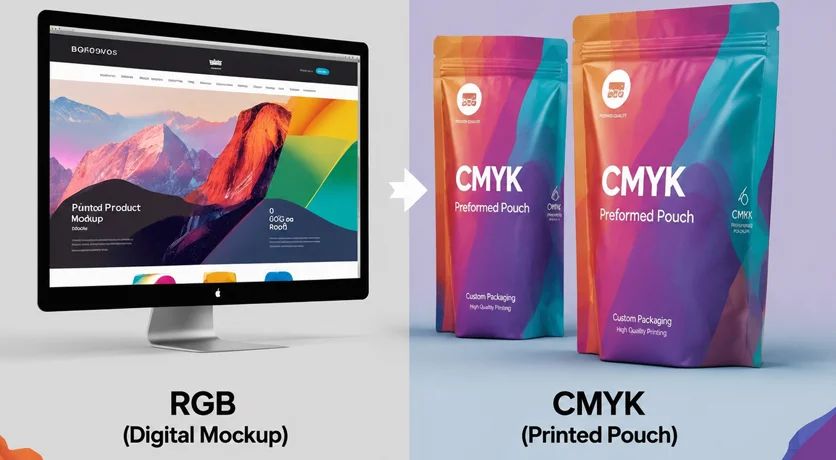
Ink does not exist in isolation. The substrate beneath it — the film, foil, or paper — determines how light passes through or reflects back to the eye. Change the substrate, and the perceived color changes.
How substrates affect color:
Different materials interact with ink in fundamentally different ways. Paper is absorbent and can dull colors, while plastics and metalized films may enhance or shift color appearance due to their non-absorbent or reflective surfaces. Depending upon the amount of absorption, the substrate color will interact with the ink and change the appearance of the color.
| Substrate Type | How It Affects Color | What to Expect |
|---|---|---|
| White opaque film (PE, PP) | Neutral, reflective base — closest to CMYK expectations | Minimal shift; most predictable |
| Clear transparent film | Allows background (product color, light) to show through | Colors appear lighter, more translucent |
| Metalized film (VMPET) | Highly reflective with silver undertone | Warm colors (red, orange, yellow) shift brownish; lighter colors pick up metallic cast |
| Kraft paper / recycled paper | Brown, absorbent surface | Colors appear darker, less saturated |
| Mono-material PE with PCR content | May have haze or color variation from recycled content | Inconsistent batch-to-batch; requires compensation |
| Coated vs. uncoated surfaces | Coating affects ink absorption and light reflection | Gloss coatings enhance saturation; uncoated surfaces dull colors |
The practical reality: A color that looks vibrant on a white opaque film may appear washed out on a clear film, dull on kraft paper, or shifted toward brown on a metalized structure. Understanding this interaction is the first step in managing color deviations when switching materials.
Surface finish is one of the strongest visual modifiers of color. A glossy finish reflects more light directly back to the viewer, making colors appear brighter, more saturated, and higher in contrast. A matte finish scatters light in multiple directions, which softens colors and can make them appear slightly darker or less vibrant.
The same color printed on a glossy film and a matte film will look like two different colors.
| Finish | Effect on Color | Brand Perception |
|---|---|---|
| Glossy | Brighter, more saturated, higher contrast | Energetic, dynamic, premium |
| Matte | Softer, slightly darker, less reflective | Sophisticated, sincere, calm |
| Soft-touch | Diffuses light heavily; muted, flat appearance | Luxurious, tactile, exclusive |
| Spot UV / gloss | Creates contrast between glossy and matte areas | Adds visual depth and emphasis |
The practical reality: If your brand identity relies on a specific shade, do not change the surface finish without re-approving the color. Many brands choose to keep one finish across all SKUs for consistency.
Flexible packaging is rarely a single layer. Most pouches go through a lamination process: printing → lamination → curing → slitting → pouch making.
During lamination, the printed film is bonded to another layer (sealant web, foil, or additional barrier film) using adhesive. This additional layer changes how light passes through and reflects back to your eye. The adhesive itself may have a slight yellow or cloudy tint; the top film may add gloss or haze.
The result: printed film before lamination can look different from the same film after lamination. This is normal — but it is a common source of confusion when brands approve a pre-lam sample and receive a post-lam production run that looks different.
The practical reality: Always request a post-lamination sample when approving colors for a new material structure. Never approve based on pre-lam film alone. A color change may also occur in a laminate after the laminate is contacted with certain adhesives, so the final laminated structure is the only reliable reference.
Review WIZ Packaging's materials and sustainability options.
To manage color deviations effectively, brands need a common language for describing and measuring color differences. That language is ΔE (Delta E).
What is ΔE? ΔE is a single numerical value that represents the total color difference between a reference sample and a production sample. It is calculated from three color dimensions: lightness (L), red/green value (a), and blue/yellow value (b*) — a system defined by the CIELAB color space.
ASTM D2244 provides standardized practices for calculating color tolerances and color differences from instrumentally measured color coordinates. This standard is widely used across industries, including coatings, plastics, printing, and packaging.
What do ΔE values mean in practice?
| ΔE Value | Visual Perception | Typical Application |
|---|---|---|
| < 1.0 | Not perceptible to the human eye | Ultra-premium / luxury packaging |
| 1.0 – 2.0 | Perceptible under controlled conditions | Most brand-critical colors |
| 2.0 – 3.0 | Noticeable to most viewers | Acceptable for secondary colors |
| > 3.0 | Readily perceptible; likely considered a mismatch | Generally unacceptable for brand colors |
According to the Color Measurement Glossary for Paper & Corrugated Packaging, a ΔE of around 1.0 may be perceptible to the human eye under controlled conditions, though acceptable tolerances depend on the application. In packaging, ΔE < 2.0 is a common tolerance for an acceptable color match. For primary brand colors, some brands set a tolerance of ΔE 2.5 or less.
The practical reality: When switching materials, expect a measurable ΔE shift. The key is to define an acceptable tolerance range before production, not after. ASTM D2244 provides the standardized methodology for this calculation.
White ink plays a critical role in flexible packaging printing, especially when printing on transparent films, metalized films, or dark backgrounds. When printing transparent flexible substrates, a white ink underlayer is frequently required to reproduce saturated colors.
How white ink affects color when switching materials:
White opaque film: May not need a white underbase; the substrate itself provides the white foundation
Clear transparent film: Requires a white underbase for saturated colors; without it, colors appear translucent and washed out
Metalized film: Often requires a full white underbase to neutralize the silver reflective cast
Kraft paper / recycled paper: May require higher white coverage to compensate for the brown, absorbent surface
Compostable films: Compostability standards may limit white ink coating weight, restricting how much white ink can be applied
The practical reality: If your new material requires a different white ink strategy — more coverage, less coverage, or a different formulation — the final color will shift. Plan for this and request proofs at the target white ink coating weight.
A specialty coffee roaster wants to switch from a conventional white opaque PET/PE pouch to a certified home-compostable clear film. Their brand color is a deep, saturated orange.
The challenge: The clear film has no white base. Without a white underbase, the orange appears translucent and pinkish. With a white underbase, the color is closer to the original — but compostability standards may limit how much white ink can be applied.
The solution: The brand requests proofs at multiple white ink coating weights, selects the highest coverage that still meets certification requirements, and approves a new physical sample. The orange is slightly less saturated than the original, but consistent and acceptable for the new sustainable line.
A pet food brand wants to upgrade its packaging from a standard gloss finish to a premium matte soft-touch finish. The artwork and substrate remain the same.
The challenge: The matte finish scatters light instead of reflecting it directly. The brand‘s signature deep blue appears darker and less vibrant on the matte surface.
The solution: The brand works with the printer to adjust the ink formulation — increasing pigment load slightly to compensate for the light-scattering effect of the matte finish. A new physical sample is approved, and the brand communicates the change to consumers as a premium packaging upgrade.
A nutritional supplement brand adds 30% post-consumer recycled content to its mono-material PE pouch to meet sustainability goals.
The challenge: Changes in fibre furnish — particularly when recycled content varies — affect the brightness and color of the base sheet. The recycled material introduces slight haze and color variation in the substrate itself.
The solution: The brand works with the supplier to establish a new color standard specifically for the PCR-containing material. A white underbase is applied to mask the substrate's inherent variation, ensuring consistent brand colors across production batches despite the recycled content variability. To see how different pouch styles serve various product categories, explore WIZ Packaging's preformed pouch capabilities.
If you are planning to switch packaging materials or surface treatments, follow this checklist to minimize surprises:
1. Identify the new substrate and finish – Be specific: clear PET/PE, metalized PET/AL/PE, matte white PE, kraft paper, etc.
2. Understand the white ink requirement – Does the new substrate need a white underbase? If so, at what coverage?
3. Request a printed proof of the actual new material – Not a paper swatch, not a digital simulation. Print on the exact film structure.
4. Request a post-lamination proof – Do not approve pre-lam color alone.
5. Compare to your current approved sample – Use standardized lighting (D65 daylight simulation) and, ideally, instrumented measurement following ASTM D2244 methodology.
6. Define the acceptable ΔE tolerance – Industry practice typically sets ΔE < 2.0 for critical brand colors.
7. Decide: adjust the color or accept the shift? – If the shift exceeds tolerance, work with your printer to adjust ink formulation, white underbase, or coating weight.
8. Retain a new physical sample – Keep it as the reference for future production batches on the new material.
Once you have clarified these key decision factors — your new substrate, finish, white ink requirements, and acceptable ΔE tolerance — comparing specific material specifications and requesting physical proofs becomes the next logical step.
Work with your packaging partner to establish:
A printed proof on the actual new material, post-lamination
A physical retained sample for future batch comparison
An agreed ΔE tolerance based on ASTM D2244 methodology
Standardized lighting conditions (D65) for visual evaluation
1. Why Color Difference Happens in Custom Printed Pouches
2. Common Flexible Packaging Defects Buyers Should Watch Before Mass Production
3. Why Colors Change When Switching Packaging Materials & Finishes
Chat on WhatsApp
+1 (617) 987-7432