
Chat on WhatsApp
+1 (617) 987-7432
Color is one of the first things customers notice about your packaging. For food, coffee, pet food, and supplement brands, pouch color is often directly tied to brand identity. But when the final printed pouch arrives, it may look slightly different from the artwork on your screen, the digital proof, or even a previous production sample.
This mismatch does not always mean a printing defect. In flexible packaging, color difference has several technical causes. Understanding them helps you set the right expectations, communicate clearly with your packaging partner, and avoid surprises before bulk production.
This article walks you through the main reasons color variation occurs — from printing methods and film materials to white ink underbases, lamination, surface finishes, and batch conditions. You will also learn how to establish a reliable color approval process.
The color you see on a computer monitor or smartphone screen is rarely the same as the final printed pouch. Screens use RGB (red, green, blue) color, while packaging printing typically uses CMYK (cyan, magenta, yellow, black) or spot colors such as Pantone.
Screen brightness, display settings, file format (PDF, JPG, PNG), and ambient lighting all affect how a color appears. This is why digital artwork alone should never be used as the sole color reference for production.
For color-sensitive projects, Pantone color codes and approved physical samples are far more reliable. A physical sample accounts for the specific film, ink, and finishing process — something no screen can replicate.
Practical tip: Always request a printed proof on your actual film material before mass production. A digital proof viewed on a calibrated monitor is helpful but not final.
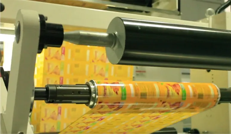
Flexible packaging can be printed using several methods. The two most common for custom pouches are digital printing and gravure (rotogravure) printing. Each produces color differently.
| Characteristic | Digital Printing | Gravure Printing |
|---|---|---|
| Ink layer thickness | Thin, variable | Thick, consistent |
| Color saturation | Good for short runs, lighter depth | High, deep, and vibrant |
| Consistency across batches | Slight variation possible | Very consistent with same cylinders |
| Best for | Small batches, test markets, many SKUs | Large volumes, repeat orders, brand colors |
| Cost structure | No cylinder fees | Cylinder engraving cost upfront |
Why this matters to you:
A digital sample and gravure bulk production may look slightly different, even with the same artwork. Gravure lays down more ink and creates a richer color depth. If your brand color is critical, discuss with your printer which method will be used for final production and request a gravure-printed proof when possible.
WIZ Packaging offers different printing technologies to serve customers better — review the full-printing customization process.
A printed pouch is not like paper. Flexible packaging uses a variety of film structures, each with different light transmission and reflection properties. Common structures include:
PET/PE (clear outer layer with polyethylene sealant)
PET/AL/PE (with aluminum foil barrier)
PET/VMPET/PE (metalized film)
OPP/PE (oriented polypropylene)
PE/PE (mono-material for recyclability)
Kraft paper structures
PCR (post-consumer recycled) content films
The same orange, red, blue, or green ink will look different on a clear transparent film versus a metalized film versus matte white film versus kraft paper. Metalized films tend to shift colors toward silver undertones. Clear films allow the product color behind to influence the visible pouch color. Matte surfaces scatter light, making colors appear softer or slightly darker.
Your takeaway: Always confirm the exact film structure before approving a color sample. If you change the material later (e.g., switching from PET/AL/PE to a recyclable mono-material), expect the printed color to shift — and plan for a new color approval.
White ink plays a critical role in flexible packaging printing, especially when printing bright colors on transparent films, metalized films, or dark backgrounds.
If you print orange, yellow, red, or light blue directly over a black or dark background — or over a metalized film — the color will appear dull, dark, or “contaminated.” To prevent this, printers apply a white ink underbase (also called white backing ink) underneath the color layer. The white reflects light back through the color layer, keeping it bright and close to the intended shade.
In addition, designs with adjacent contrasting colors may require trapping — a slight overlap between color edges — to prevent visible gaps or dirty lines caused by misregistration.
What this means for your brand:
If your logo or hero color is a bright tone, ask your packaging partner whether a white underbase is included. Also confirm the white ink coverage (e.g., 70%, 100%) because coverage directly affects color brightness. Not all designs need a full white underbase, but for opaque, vivid colors on non-white substrates, it is essential.
Most custom printed pouches go through multiple production steps:
Printing → Lamination → Curing → Slitting → Pouch Making
During lamination, the printed film is bonded to another film layer (e.g., a sealant web or foil) using adhesive. This additional layer changes how light passes through and reflects back to your eye. The adhesive itself may have a slight yellow or cloudy tint, and the top film may add gloss or haze.
As a result, the printed film after lamination can look different from the same film before lamination. This is expected, particularly for:
High-barrier structures (with aluminum or EVOH)
Metalized films
Matte or soft-touch surfaces
Recyclable mono-material films (where lamination conditions are tuned for material compatibility)
WIZ Packaging uses both dry lamination and solvent-free lamination, selecting the most suitable method based on each client’s purpose, ensuring consistent results across different pouch applications.
Actionable advice: Always request a post-lamination sample, not just a print-on-film sample. Compare it to your approved artwork under standardized lighting (e.g., D65 daylight simulation). Document any acceptable shift — for example, “ΔE < 2.0” — as part of your quality agreement.
The surface finish is one of the strongest visual modifiers of color.
| Finish | Effect on Color |
|---|---|
| Glossy (high-gloss) | Colors appear more saturated, brighter, and higher contrast |
| Matte | Colors appear softer, slightly darker, and less reflective |
| Sand matte/velvet | Diffuses light heavily; colors look muted and flat |
| Soft-touch coating | Similar to matte, with added texture that reduces specular highlights |
| Spot UV / gloss局部 | Creates contrast between glossy and matte areas on same pouch |
The same Pantone color printed on a glossy film and a matte film will look like two different colors. This is why you must confirm both color and surface finish together before production.
If your brand identity relies on a specific shade, do not change the surface finish without re-approving the color. Many brands choose to keep one finish across all SKUs for consistency. WIZ Packaging offers matte and high-tactile printing finishes to deliver premium brand positioning through both visual and tactile details.
Even when you use the same artwork, same material, same printing method, and same finish, small color differences can still occur between production batches. This is not unique to your supplier — it is a reality of industrial printing.
Factors that cause batch-to-batch variation include:
Ink viscosity (thicker ink deposits more color)
Machine speed (faster runs may apply thinner ink layers)
Drying temperature (affects ink curing and final hue)
Humidity and ambient conditions (affects ink flow and substrate behavior)
Raw material batches (minor differences in film surface energy or ink pigmentation)
Cylinder wear (for gravure, over many millions of impressions)
A responsible packaging manufacturer will control these variables within an agreed tolerance — typically measured as ΔE (Delta E). The CIELAB color space, developed by the International Commission on Illumination (CIE) in 1976, defines color in three dimensions: lightness (L), red/green value (a), and blue/yellow value (b*) — the foundation for all ΔE calculations.
ΔE is the single numerical measure of total color difference between a reference sample and a production sample. According to the Color Measurement Glossary: Paper & Corrugated Packaging, a ΔE of around 1.0 may be perceptible to the human eye under controlled conditions, though acceptable tolerances depend on the application. In flexible packaging, ΔE < 2.0 is generally considered visually acceptable for most brand colors, while ΔE < 1.0 is very tight.
Consumer perception research confirms the importance of this metric: consistent brand colors build recognition and trust, while noticeable tonal variations can raise concerns about product authenticity and negatively impact purchase decisions. Rigorous color control therefore directly supports brand trust.
For you as a brand buyer:
Always request a physical production sample (also called “golden sample” or “approved sample”) before full-scale production. Keep that sample in a dark, cool place. When future batches arrive, compare them to that same physical sample — not to memory or a screen. Define an acceptable ΔE range in your purchasing specification.
The brand uses a high-barrier metalized structure with a matte finish. They provide a Pantone color code and a physical pre-production sample. During bulk printing, the printer applies a white underbase under the red to prevent the metalized layer from darkening the color. Post-lamination, the red shifts slightly warmer. The brand accepts ΔE < 1.5 because the final pouch looks consistent across the entire run.
The brand chooses digital printing for short runs. Each pouch uses a clear PET/PE structure with no white underbase. Colors appear lighter and more transparent than the original CMYK artwork. The brand accepts this because speed-to-market and SKU flexibility are more important than absolute color matching across flavors.
Define your color priority level. Is it “must match Pantone exactly under any light” (high-cost, high-control) or “acceptable within a range as long as it looks good on shelf” (more flexible)? Communicate that clearly to your packaging partner.
To see how different pouch structures affect both color and barrier performance, explore WIZ Packaging’s application examples for coffee, pet food, and nutritional supplements.
Before your next custom pouch order, go through this checklist with your packaging supplier:
Color reference – Provide Pantone code, not just a screen image.
Material structure – Confirm exact film layers (e.g., PET/AL/PE).
White underbase – Decide if needed; specify coverage percentage.
Printing method – Digital, gravure, or flexo? Request proof using final method.
Surface finish – Glossy, matte, or soft-touch? Approve color on that finish.
Lamination – Request post-lamination sample, not pre-lam only.
Tolerance – Agree on ΔE range (e.g., ΔE ≤ 2.0 for critical brand colors).
Physical sample retention – Keep one approved sample for future batch comparison.
Once you have clarified these decision factors, comparing specific specifications of available pouch constructions becomes the next logical step. You can review WIZ Packaging’s range of sustainable film options for color-critical applications, or read our guide on how to balance shelf appeal with functional barriers.
How to Define an Acceptable ΔE Range for Your Brand’s Flexible Packaging
Why Colors Change When Switching Packaging Materials & Finishes
The Role of White Ink Underbase in Sustainable Packaging Design
How to Prepare Artwork Files to Minimize Color Shift in Lamination
Chat on WhatsApp
+1 (617) 987-7432