
Chat on WhatsApp
+1 (617) 987-7432
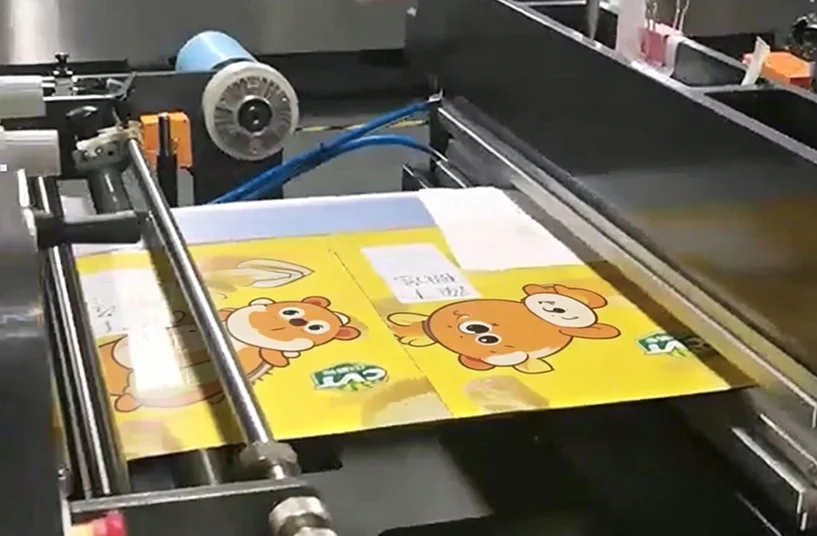
You spent hours perfecting your packaging design on a high-resolution monitor. The teal is exactly the shade you wanted. The orange pops. The gradient looks smooth. Then the first printed bags arrive — and the teal looks slightly green, the orange is duller, and the gradient has disappeared into a flat tone.
This is one of the most common frustrations in custom packaging production. It is also one of the most preventable — once you understand why screens and printed materials speak different color languages.
In this article, we explain why on-screen artwork colors rarely match printed bags, how the RGB-to-CMYK conversion changes everything, and what you can do to ensure your final packaging looks as intended — without relying on your monitor as a color reference.
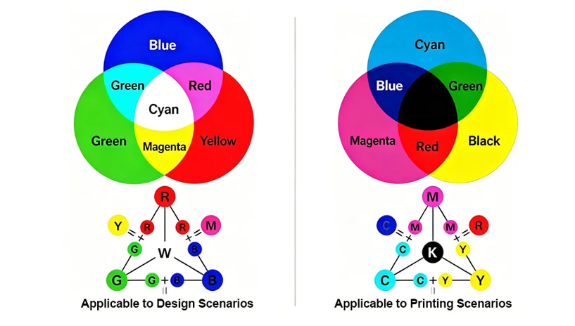
The single biggest reason on-screen colors do not match printed bags is that screens and printing presses use completely different color models.
| Aspect | Screens (RGB) | Printing (CMYK) |
|---|---|---|
| Color model | Additive (light-based) | Subtractive (ink-based) |
| Primary colors | Red, Green, Blue | Cyan, Magenta, Yellow, Black (Key) |
| Gamut (color range) | Wider — can display many bright, saturated colors | Narrower — cannot reproduce some RGB brights |
| How it works | Light emitted from screen combines to create colors | Inks absorb certain wavelengths; reflected light reaches your eye |
RGB starts with black (no light) and adds red, green, and blue light to create white. This is why your phone screen can display electric blues and neon pinks. CMYK starts with white (the substrate or white ink underbase) and subtracts wavelengths using translucent inks. This is why some highly saturated RGB colors — like bright cyan or vivid orange — simply cannot be reproduced in CMYK printing.
What this means for your packaging: The brilliant lime green you see on your design monitor may fall outside the printable CMYK gamut. When the file is converted, the printing software substitutes the closest possible CMYK match. That “closest match” can look significantly different, especially for colors with high saturation or brightness.
To understand how printing methods like gravure and digital handle color differently, review WIZ Packaging’s overview of printing technologies for custom pouches.
Even after converting your artwork to CMYK, the printed result will vary depending on the substrate. This is where many brands get confused: they expect the same digital file to produce identical color on a white opaque pouch, a clear film, a metalized bag, and a kraft paper stand-up pouch. It will not.
The substrate determines how light interacts with the ink:
White opaque film (e.g., white PE) provides a neutral, reflective base — closest to how CMYK is designed to work.
Clear transparent film allows the product color or any background to show through, shifting the perceived color.
Metalized film (VMPET) adds a silver undertone, which can turn warm colors (red, orange, yellow) brownish or cool tones greenish.
Kraft paper or recycled paper is brown and absorbent; inks appear darker and less saturated unless a white underbase is applied.
This is why a single CMYK file will produce visibly different results across material types. The printer does not make a mistake — the physics of light reflection and absorption change.
If screens cannot be trusted and CMYK has limits, what should you use as a color reference? The industry standard is the Pantone Matching System (PMS).
Pantone colors are pre-mixed inks formulated to specific spectral values, not created by combining CMYK percentages. Each Pantone color has a unique formula, and a physical Pantone swatch book shows exactly how that color will appear on a coated or uncoated paper stock.
However, even Pantone colors shift when printed on flexible films. A Pantone swatch printed on coated paper will look different when printed on a metalized film with a matte finish. This is why the final color reference for custom printed pouches should always be:
A physical sample printed on your actual film structure (pre- and post-lamination)
Approved under standardized lighting (D65 daylight simulation)
Do not approve a color based on a PDF, a JPEG, or even a calibrated monitor. Use physical samples.
Even if you work in CMYK and use Pantone codes, your screen’s settings will affect how you perceive the design. Consider these variables:
Brightness level – A screen set to 100% brightness will make colors appear lighter and more vivid than a screen at 50%.
Color temperature – A “warm” screen (lower Kelvin) adds yellow/red; a “cool” screen (higher Kelvin) adds blue.
Ambient lighting – Viewing artwork under warm office lighting versus cool daylight changes perceived color.
Screen technology – OLED, IPS, and LCD panels have different gamuts and contrast ratios.
Most designers use hardware calibration tools (e.g., X-Rite, Datacolor) to standardize their monitors. But even a perfectly calibrated monitor cannot predict how CMYK inks will interact with a specific film, adhesive, and lamination.
Practical advice: If you must use a screen for color review, ensure your monitor is calibrated (target: D65, 120 cd/m², gamma 2.2). But always validate with a printed proof on your final material.
There are two types of proofs, and confusing them leads to mismatched expectations.
| Proof Type | What It Is | Reliability for Color |
|---|---|---|
| Soft proof | On-screen simulation of CMYK output (e.g., PDF/X) | Low — useful for layout, not final color |
| Hard proof | Physically printed sample on actual or similar substrate | High — especially when printed on your exact film structure |
A soft proof is convenient and fast. It helps you check text placement, barcode position, and die-cut lines. But it cannot account for substrate color, surface finish, lamination shift, or white ink coverage. A hard proof — sometimes called a “contract proof” — is printed on material as close as possible to your production substrate. For flexible packaging, the most reliable hard proof is a production-intent sample printed on your chosen film, laminated, and pouched.
For color-critical brands: Always request a hard proof before bulk production. The small upfront cost and time are far less expensive than reprinting tens of thousands of pouches.
The brand provides a Pantone color code (PMS 185 C for red) and a PDF artwork file. They request a digital soft proof only, approving it based on their office monitor. When the first printed pouches arrive on a clear PET/PE film (no white underbase), the red appears pinkish and translucent. The brand is disappointed.
What went wrong? No hard proof was requested. The red was printed without a white underbase on a clear film, allowing light to pass through and the product inside to affect the color.
Better approach: Request a hard proof of the actual film structure, with and without white underbase, before approving production.
The coffee brand has been using the same deep brown on a metalized pouch for years. For a new roast, they change only the flavor label but keep the base color. They provide a retained physical sample from the previous production run, plus the Pantone code. The printer produces a proof on the same metalized structure, compares it to the retained sample under D65 lighting, and matches within ΔE < 1.5. Production runs match perfectly.
Key takeaway: A physical retained sample is the most reliable color reference. Keep one from each production run in a dark, cool place and use it for future batch comparisons.
To see how different pouch structures — including metalized and clear films — affect color and barrier performance, explore WIZ Packaging’s application examples for coffee and supplements.
While you cannot fully control the printing process from your computer, you can prepare your files to minimize surprises:
Convert RGB to CMYK early – Do this before finalizing design, not at the last minute. Watch for dramatic shifts in bright blues, greens, and oranges.
Use Pantone colors for brand-critical shades – Specify PMS numbers, not just CMYK percentages.
Avoid over-saturated RGB colors – Neon, fluorescent, and highly saturated hues will not reproduce in CMYK.
Communicate your substrate and finish – Tell your printer the exact film structure and surface finish (gloss/matte) before they create a proof.
Request a white ink underbase if needed – For bright colors on clear, metalized, or dark substrates.
Most color mismatches originate in the gap between expectation (what the designer sees on screen) and reality (what the press can produce on a given substrate). Closing that gap starts with understanding the technical limitations of both.
Once you have clarified these key decision factors — your substrate, finish, need for white underbase, and color tolerance — comparing specific printing specifications and requesting a hard proof becomes the next logical step.
Work with your packaging partner to establish a color approval workflow that includes:
A physical hard proof of your actual film structure, post-lamination
A retained sample (golden sample) for future batch comparison
An agreed ΔE tolerance (e.g., ΔE < 2.0 for primary brand colors)
Standardized lighting conditions (D65) for visual evaluation
For a deeper dive into color measurement, batch variation, and ΔE tolerances in flexible packaging, see our related guide on why color difference happens in custom printed pouches.
The Role of White Ink Underbase in Sustainable Packaging Design
Matte vs Glossy Finish: How Surface Texture Changes Color Perception
Digital Proof vs Physical Sample: What Every Brand Should Know
How to Prepare Artwork for Flexible Packaging: A Step-by-Step Checklist
Chat on WhatsApp
+1 (617) 987-7432